When you’re planning a renovation, the Bathroom Colour Design Sydney homeowners choose should balance personal style with real-world performance. Lighting conditions, room size, surface finishes, ventilation, and long-term maintenance all influence which colours will look good not just on day one, but for years to come. This guide is informed by hands-on renovation experience across Greater Sydney, combining design principles with practical site knowledge so your colour choices translate cleanly from concept to completion.
Bathroom Colour Design Sydney: How Colour Shapes Space, Mood, and Value
Colour does far more than set the aesthetic tone—it affects how large a bathroom feels, how easy it is to maintain, and even how comfortable the space feels during daily use. In Sydney homes, where bathrooms range from compact apartment ensuites to large family bathrooms, colour selection must be deliberate.
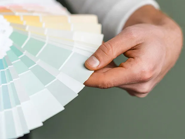
Light tones such as warm whites, soft greys, and pale beiges remain popular because they visually expand smaller rooms and reflect light efficiently. These shades work particularly well with natural materials like oak vanities, stone-look tiles, and brushed metal fixtures. Muted pastels—sage green, misty blue, or dusty blush—are increasingly used to create calm, spa-inspired bathrooms while softening harder finishes like concrete or porcelain.
Darker colours, including navy, charcoal, forest green, or plum, can introduce a sense of luxury when used selectively. In practice, these tones perform best as feature elements—vanities, niches, or feature walls—balanced with lighter surrounding surfaces. On-site experience consistently shows that controlling sheen levels is critical: matte or low-sheen finishes reduce glare, conceal minor imperfections, and age better in humid environments.

Bathroom Colour Design Sydney: Planning with Light, Reflectance, and Orientation
One of the most common mistakes homeowners make is choosing colours without considering how light interacts with them. Bathrooms are highly sensitive to lighting changes, and colours can shift dramatically between daylight and artificial light.
Natural and Artificial Light Assessment
Natural light orientation plays a major role. North-facing bathrooms in Sydney typically receive warmer, more consistent daylight and can comfortably support cooler greys or blue undertones. South-facing bathrooms often benefit from warmer neutrals to counteract cooler ambient light. Artificial lighting should be layered—task lighting at mirrors, ambient ceiling lighting, and accent lighting in niches or under vanities—to ensure colours read accurately at all times of day.
Reflectance, Sheen, and Surface Behaviour
Reflectance is equally important. Gloss tiles intensify colour and reflect light, which can be effective in small bathrooms but may also highlight water marks and soap residue. Matte tiles and low-sheen paints provide a more grounded, contemporary look and are often easier to maintain. Testing samples vertically and horizontally under real lighting conditions—morning and evening—is a professional best practice that prevents costly rework.
Bathroom Colour Design Sydney: Feature Areas That Elevate Design
Feature showers, niches, and vanities are ideal locations to introduce stronger colours or textures without overwhelming the room. A contrasting niche tile or a coloured vanity can add depth while keeping walls and floors neutral, ensuring longevity and broad appeal.
Materials, Durability, and Long-Term Performance
A successful colour scheme must work hand in hand with durable materials and proven construction methods. Bathrooms are high-moisture environments, and colour decisions should always consider how materials will perform over time.
Tiles in larger formats reduce grout lines, creating a cleaner look and simplifying maintenance. Mid-tone grout colours are often the most practical choice, balancing contrast while disguising staining. Stone and stone-look surfaces with subtle veining add visual interest without visually shrinking the space, making them suitable for both small and large bathrooms.
Joinery finishes also play a key role. Timber tones such as oak or walnut introduce warmth to cooler palettes, while colour-matched polyurethane cabinetry can become a strong design focal point. Consistency in metal finishes—whether chrome, brushed nickel, matte black, or brass—prevents visual clutter and reinforces a cohesive design language.
From a construction perspective, colour and finish selections must align with waterproofing systems and substrate preparation. Proper waterproofing, applied by licensed trades, ensures that finishes perform as intended and maintain their appearance over time. RJG Group follows Australian Standards and industry best practices, drawing on experience as members of the master builders association to deliver bathrooms that are both visually refined and structurally sound.
Small vs Large Bathrooms: Applying Colour with Confidence
In smaller bathrooms, lighter wall colours paired with slightly deeper floor tones help anchor the space while maintaining openness. Introducing colour through a vanity or accessories often achieves better results than dark walls. Larger bathrooms allow for more contrast—patterned floors, darker vanities, or feature walls—provided they are balanced with neutral surrounding surfaces.

A structured workflow helps streamline decisions: start with a must-have element such as a feature tile or vanity, select complementary wall and floor finishes, lock in a single metal finish, and finalise paint colours last. On a recent Eastern Suburbs project, adjusting wall paint two tones warmer after evening light testing preserved the design intent while significantly improving warmth and comfort.
Why Work With RJG Group
RJG Group is a licensed and insured Sydney renovation company specialising in bathroom, kitchen, and laundry renovations. Our process integrates design guidance with disciplined trade coordination, ensuring that colour selections, materials, and finishes are executed accurately on site. Every project benefits from structured quality control checks, clear communication, and practical design advice grounded in real renovation experience.

For homeowners seeking confidence and clarity, we provide transparent guidance from concept through to completion. Explore our recent projects, read verified client reviews, or request a free measure and quote to begin designing a bathroom that looks exceptional and performs long term.


 Defining Modern Excellence with Integrity


